Matisse's use of greens showcases a vibrant palette that breathes life into his compositions, blending natural hues with bold, expressive tones to evoke emotion and depth. These greens often serve as focal points, enhancing contrast and harmony within his artwork. Discover how Matisse's innovative approach to greens transforms his paintings by reading the rest of the article.
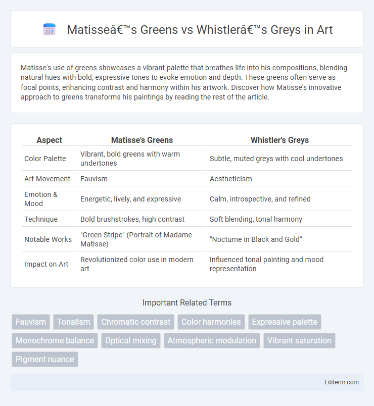
Table of Comparison
| Aspect | Matisse's Greens | Whistler's Greys |
|---|---|---|
| Color Palette | Vibrant, bold greens with warm undertones | Subtle, muted greys with cool undertones |
| Art Movement | Fauvism | Aestheticism |
| Emotion & Mood | Energetic, lively, and expressive | Calm, introspective, and refined |
| Technique | Bold brushstrokes, high contrast | Soft blending, tonal harmony |
| Notable Works | "Green Stripe" (Portrait of Madame Matisse) | "Nocturne in Black and Gold" |
| Impact on Art | Revolutionized color use in modern art | Influenced tonal painting and mood representation |
Introduction: Color as Artistic Signature
Matisse's use of vibrant greens in his paintings creates a dynamic and expressive atmosphere that defines his artistic signature, emphasizing emotion and movement through bold color choices. Whistler's greys, characterized by subtle tonal variations and muted palette, establish a refined, atmospheric quality that highlights mood and composition over vivid color. Both artists utilize color strategically to evoke distinct emotional responses, positioning their palettes as essential elements in their creative identities.
The Emotional Impact of Matisse’s Greens
Matisse's use of vibrant greens evokes a sense of vitality and renewal, contrasting sharply with Whistler's more subdued greys, which tend to convey melancholy and restraint. The lush, dynamic greens in Matisse's compositions stimulate feelings of growth and harmony, engaging viewers with an uplifting emotional energy. This palette choice creates an immersive experience that emphasizes nature's vibrancy and emotional richness.
Whistler’s Philosophy: The Nuances of Grey
Whistler's philosophy in his use of grey centers on exploring subtle tonal variations and the emotional depth embedded within muted palettes, contrasting Matisse's vibrant greens that emphasize bold expression. His nuanced greys create a sophisticated atmosphere that invites contemplation and reveals complexity through minimal color shifts. This subtlety reflects Whistler's belief in art as a harmonious balance between form and tone rather than vivid chromatic impact.
Historical Context: Color Trends in Modern Art
Matisse's Greens and Whistler's Greys reflect distinct color trends shaped by early 20th-century modern art movements. Matisse's vibrant greens exemplify Fauvism's bold, expressive use of color to evoke emotion, contrasting with Whistler's subdued greys that embody Tonalism's emphasis on mood and atmosphere. These approaches highlight the evolving artistic dialogue on color theory and its psychological effects during the transition from 19th-century to modern art.
Techniques: How Matisse Achieved Bold Greens
Matisse achieved bold greens through the use of vibrant, pure pigments applied in flat, unmodulated areas that enhance color intensity and saturation. His technique involved layering transparent and opaque pigments to create depth while maintaining a vivid, luminous quality. Unlike Whistler's restrained and muted greys achieved through subtle tonal gradations, Matisse's greens emphasize contrast and emotional impact via deliberate brushwork and color juxtaposition.
Palette Choices: Whistler’s Grey Harmonies
Whistler's palette in his Grey Harmonies series emphasizes nuanced variations of muted greys, blues, and soft earth tones to evoke subtle atmospheric effects and refined tonal balance. He meticulously blends shades to create harmonious, monochromatic scenes that prioritize mood and texture over vibrant color contrast. This restrained color approach contrasts sharply with Matisse's Greens, which employ vivid, saturated hues to convey emotional intensity and dynamic composition.
Psychological Effects: Green vs Grey in Art
Green in Matisse's work evokes vitality, growth, and emotional renewal, stimulating a sense of harmony and tranquility that engages viewers on a psychological level. Whistler's greys convey subtlety, introspection, and calmness, often provoking a contemplative or melancholic response that reflects the complexities of human emotion. The contrasting psychological effects of these colors highlight how green energizes and soothes, while grey invites quiet reflection and emotional depth in art.
Iconic Works: Examples of Color Use
Matisse's use of vibrant greens in works like "The Green Stripe" emphasizes bold, expressive contrasts that convey emotional intensity and vitality. Whistler's subtler grey palette in "Nocturne in Black and Gold" showcases a refined, atmospheric quality prioritizing mood and tonal harmony over vivid color. These iconic color choices define their signature styles, with Matisse's greens symbolizing life and energy, while Whistler's greys evoke introspection and tranquility.
Influence on Future Artists and Movements
Matisse's vibrant use of greens revolutionized color theory and inspired Fauvist artists to embrace bold, expressive palettes that challenged traditional realism. Whistler's nuanced greys influenced Tonalism and early Modernism by emphasizing atmosphere and subtle tonal gradations, shaping later movements like Impressionism and Expressionism. Both artists' color innovations fostered new artistic directions, encouraging experimentation with mood and emotion through chromatic choices.
Conclusion: Contrasts and Legacy
Matisse's greens embody vibrant, expressive energy that revolutionized modern color theory, while Whistler's greys exude subtlety and tonal harmony rooted in aesthetic restraint. The contrast between Matisse's audacious palette and Whistler's muted tones highlights their distinct contributions to art history, influencing generations of painters in chromatic experimentation and tonal composition. Their legacies persist as benchmarks for exploring emotional depth through color intensity versus nuanced tonal variation.
Matisse’s Greens Infographic