The primary palette defines the core colors that shape your brand's visual identity and create consistency across all design materials. Choosing harmonious hues within the primary palette ensures your communication stands out while maintaining a cohesive and professional look. Discover how to expertly select and apply your primary palette by reading the rest of the article.
Table of Comparison
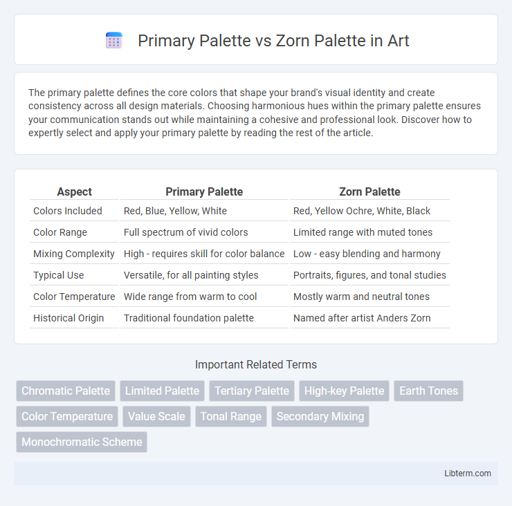
| Aspect | Primary Palette | Zorn Palette |
|---|---|---|
| Colors Included | Red, Blue, Yellow, White | Red, Yellow Ochre, White, Black |
| Color Range | Full spectrum of vivid colors | Limited range with muted tones |
| Mixing Complexity | High - requires skill for color balance | Low - easy blending and harmony |
| Typical Use | Versatile, for all painting styles | Portraits, figures, and tonal studies |
| Color Temperature | Wide range from warm to cool | Mostly warm and neutral tones |
| Historical Origin | Traditional foundation palette | Named after artist Anders Zorn |
Understanding the Primary Palette
The Primary Palette consists of the three pure primary colors--red, blue, and yellow--allowing artists to mix a full spectrum of hues with maximum color vibrancy and versatility. Understanding the Primary Palette enables painters to create more dynamic and complex color relationships by blending these fundamental pigments. Unlike the Zorn Palette, which limits the palette to four colors, the Primary Palette offers broader chromatic range and flexibility in color mixing.
What Is the Zorn Palette?
The Zorn Palette is a traditional painting palette consisting of just four colors: yellow ochre, ivory black, cadmium red, and titanium white, optimized for creating a wide range of naturalistic tones with minimal pigments. It contrasts with primary palettes that typically include a broader spectrum of colors such as ultramarine blue, alizarin crimson, and cadmium yellow to mix a full color range. Artists favor the Zorn Palette for its ability to yield harmonious and earthy hues, particularly effective in skin tones and portraiture.
Historical Origins of Both Palettes
The Primary Palette, rooted in Renaissance art theory, utilizes the fundamental colors red, yellow, and blue to provide a full spectrum for mixing and representation, reflecting the early understanding of color principles in Western art history. The Zorn Palette, named after Swedish painter Anders Zorn in the late 19th century, simplifies pigment choices to just four colors--white, black, red (vermilion), and yellow (ochre)--emphasizing tonal harmony and limited chromatic range prevalent in Nordic painting traditions. Both palettes evolved from distinct historical contexts, the Primary Palette from classical art education and the Zorn Palette from a regional artist's pursuit of realism and economy in color usage.
Comparing Color Choices: Primary vs Zorn
The Primary Palette consists of pure red, blue, and yellow pigments, providing a broad spectrum of hues and flexibility for mixing full-color ranges, while the Zorn Palette limits itself to just four colors: yellow ochre, ivory black, vermilion (or cadmium red), and white, focusing on earth-toned and muted colors with emphasis on tonal harmony. The Primary Palette enables artists to create vivid, highly saturated colors and diverse shades, whereas the Zorn Palette excels in producing subtle, nuanced flesh tones and atmospheric effects with a restricted but balanced color set. Understanding the color choices highlights how the Primary Palette maximizes chromatic variety and the Zorn Palette prioritizes simplicity and tonality to achieve distinct stylistic effects.
Range and Limitations of Each Palette
The Primary Palette, consisting of red, blue, and yellow, offers a wide color range enabling the mixing of vibrant, diverse hues, ideal for versatile and complex artworks. The Zorn Palette, limited to yellow ochre, vermilion, ivory black, and white, creates a more muted and harmonious color scheme, often favoring earthy and skin tones but restricting bright, vivid colors. While the Primary Palette excels in color variety, the Zorn Palette promotes subtle tonal unity and simplicity, making each suited to different artistic needs and styles.
Mixing Techniques and Color Harmony
The Primary Palette relies on red, blue, and yellow pigments, allowing artists to mix a vast range of hues and achieve vibrant contrasts, making color harmony dynamic and diverse. In contrast, the Zorn Palette uses a limited set of four colors--typically yellow ochre, ivory black, cadmium red, and white--enabling smoother blending and subtle tonal variations that enhance warm and muted color harmonies. Mixing techniques differ as the Primary Palette demands precise balancing of pure colors for saturation, while the Zorn Palette emphasizes reduction and restraint to create cohesive, earthy compositions.
Advantages of Using a Primary Palette
Using a primary palette allows artists to mix a broader range of vibrant and accurate colors by utilizing pure red, yellow, and blue pigments, enhancing color harmony and balance in paintings. This palette supports greater versatility across various subjects and styles, making it ideal for both beginners and experienced painters seeking to develop strong color mixing skills. The primary palette's simplicity encourages a deeper understanding of color theory and pigment interaction, ultimately improving artistic control and creativity.
Benefits of Painting with the Zorn Palette
The Zorn Palette, consisting of limited colors--typically titanium white, yellow ochre, cadmium red, and ivory black--offers enhanced color harmony and simplicity, reducing decision fatigue for artists. This palette enables painters to achieve a striking range of naturalistic skin tones and muted earth hues with minimal mixing, promoting efficiency and consistency in portraiture and figure painting. Using the Zorn Palette also encourages mastery of value and temperature control, crucial for creating depth and realism with fewer colors.
Artistic Styles Best Suited for Each Palette
The Primary Palette, consisting of red, blue, and yellow, excels in achieving vibrant, diverse color ranges ideal for detailed and realistic artistic styles such as realism and impressionism. The Zorn Palette, limited to red, yellow ochre, black, and white, suits tonal, portrait, and figure painting, emphasizing subtle value shifts and muted earth tones frequently used in classical and traditional styles. Artists favor the Zorn Palette for its cohesiveness and harmony, while the Primary Palette offers expansive versatility for bold, colorful compositions.
Choosing the Right Palette for Your Art
Choosing the right palette for your art depends on your desired color harmony and mixing flexibility. The Primary Palette, consisting of red, blue, and yellow, offers a broad spectrum of hues ideal for vibrant and diverse color creation. In contrast, the Zorn Palette, limited to red, yellow, black, and white, excels in producing subtle tonal variations and muted colors, making it perfect for artists focused on portraiture and limited color harmony.
Primary Palette Infographic