A flow map visually represents the sequence of steps in a process, making complex information easier to understand and follow. It uses shapes and arrows to guide your eyes through a series of actions or decisions, improving clarity and efficiency. Explore the rest of the article to learn how to create and use flow maps effectively.
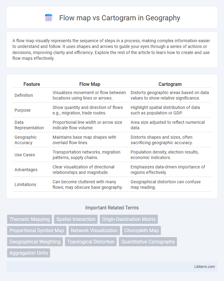
Table of Comparison
| Feature | Flow Map | Cartogram |
|---|---|---|
| Definition | Visualizes movement or flow between locations using lines or arrows. | Distorts geographic areas based on data values to show relative significance. |
| Purpose | Show quantity and direction of flows e.g., migration, trade routes. | Highlight spatial distribution of data such as population or GDP. |
| Data Representation | Proportional line width or arrow size indicate flow volume. | Area size adjusted to reflect numerical data. |
| Geographic Accuracy | Maintains base map shapes with overlaid flow lines. | Distorts shapes and sizes, often sacrificing geographic accuracy. |
| Use Cases | Transportation networks, migration patterns, supply chains. | Population density, election results, economic indicators. |
| Advantages | Clear visualization of directional relationships and magnitude. | Emphasizes data-driven importance of regions effectively. |
| Limitations | Can become cluttered with many flows; may obscure base geography. | Geographical distortion can confuse map reading. |
Introduction to Flow Maps and Cartograms
Flow maps visualize movement and connections between locations by using lines whose width represents the volume of flow, aiding in understanding migration, trade, or traffic patterns. Cartograms distort geographic areas based on a particular variable, such as population or economic output, to emphasize the importance of those values rather than accurate spatial relationships. These mapping techniques offer distinct approaches to spatial data representation, focusing on movement intensity versus variable-driven geographic distortion.
Defining Flow Maps: Purpose and Features
Flow maps visualize movement between geographic locations, emphasizing direction and volume of flows such as migration, trade, or traffic. They combine spatial data with quantitative attributes to depict patterns of connectivity and intensity through varying line thickness and arrows. Key features include scalable lines representing flow magnitude and geographic accuracy to retain spatial context.
Understanding Cartograms: Types and Applications
Cartograms distort geographic areas based on statistical data, with common types including contiguous, non-contiguous, and Dorling cartograms, each serving unique visualization purposes. They effectively illustrate variables like population density, election results, or economic output by resizing regions proportional to data values rather than physical size. Applications span from demographic studies and political analysis to resource allocation and urban planning, enhancing spatial data interpretation beyond traditional flow maps that emphasize movement or connections.
Visualizing Data: Flow Maps vs Cartograms
Flow maps visualize movement between locations through directional lines, emphasizing the magnitude and direction of flows such as migration or trade routes. Cartograms distort geographic areas proportionally to a specific data variable like population or GDP, allowing viewers to quickly grasp spatial distribution and relative size. Both methods enhance data comprehension by transforming geographic context, but flow maps highlight relationships and dynamics, while cartograms focus on volumetric representation.
Data Representation Techniques
Flow maps use lines of varying width to represent the quantity and direction of movement between locations, making them ideal for visualizing migration patterns, trade flows, or traffic routes. Cartograms distort geographic areas based on a thematic variable, such as population or economic output, emphasizing data magnitude over spatial accuracy. Both techniques transform spatial information to highlight relationships and trends, enhancing the interpretability of complex datasets in geographic analysis.
Key Advantages of Flow Maps
Flow maps effectively visualize the movement of goods, people, or information, highlighting both the direction and volume of flows with varying line thickness. They enable clear representation of networks and connections over geographic space, making complex spatial interactions easier to understand. Flow maps excel in illustrating dynamic patterns such as migration, trade routes, or traffic flows, providing valuable insights for decision-making.
Key Advantages of Cartograms
Cartograms offer the key advantage of visually representing data by resizing geographic regions according to specific variables, enhancing the intuitive understanding of quantitative information such as population or economic metrics. This method emphasizes relative magnitude over precise geographic accuracy, making it easier to identify patterns and disparities in spatial data. Unlike flow maps, which focus on movement between locations, cartograms effectively communicate proportional relationships within spatial datasets.
Limitations and Challenges
Flow maps struggle with visual clutter and overlapping lines, making it difficult to accurately interpret complex movement patterns or large datasets. Cartograms often face challenges in maintaining geographic recognition while distorting areas to represent data values, leading to potential misinterpretation of spatial relationships. Both visualization types require careful design to balance clarity and data accuracy, especially when used for dynamic or multi-variable data analysis.
Choosing Between Flow Maps and Cartograms
Choosing between flow maps and cartograms depends on the visualization goal: flow maps effectively illustrate movement or traffic between locations by using arrows proportional to flow volume, making them ideal for transportation or migration analysis. Cartograms distort geographic areas based on statistical data, enhancing the perception of magnitude for variables like population or economic output, suitable for comparative regional analysis. Selecting the appropriate map type enhances interpretability by aligning visual emphasis with the specific spatial data relationships being communicated.
Conclusion: Selecting the Right Visualization Tool
Choosing between a flow map and a cartogram depends on the primary focus of the data presentation: flow maps excel in illustrating movement patterns like migration or trade routes, while cartograms effectively emphasize quantitative spatial relationships by resizing geographic areas proportional to data values. For visualizing directional flows and connectivity, flow maps provide clear, intuitive representations that highlight pathways and volume. Cartograms offer strong impact in portraying statistical distribution across regions but may distort geography, so the selection must align with whether spatial accuracy or data magnitude emphasis is critical for analysis and communication.
Flow map Infographic