Proportional symbol maps use symbols of varying sizes to represent data quantities across geographic locations, making complex information visually accessible and easy to interpret. They are especially effective for highlighting differences in values such as population, sales, or resource distribution on a regional scale. Explore this article to discover how proportional symbol maps can enhance your data visualization and storytelling.
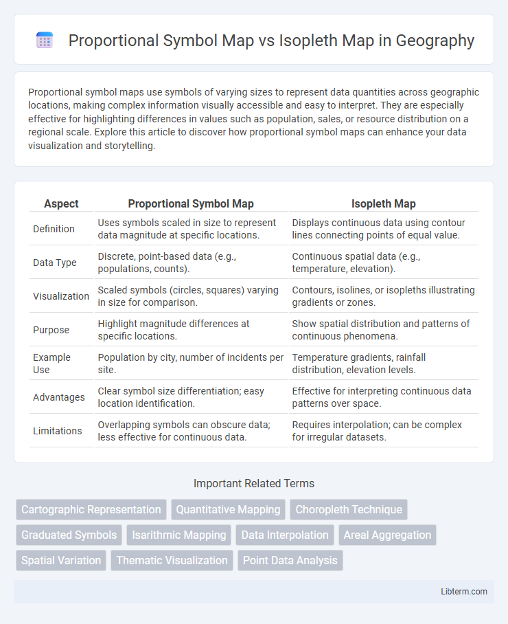
Table of Comparison
| Aspect | Proportional Symbol Map | Isopleth Map |
|---|---|---|
| Definition | Uses symbols scaled in size to represent data magnitude at specific locations. | Displays continuous data using contour lines connecting points of equal value. |
| Data Type | Discrete, point-based data (e.g., populations, counts). | Continuous spatial data (e.g., temperature, elevation). |
| Visualization | Scaled symbols (circles, squares) varying in size for comparison. | Contours, isolines, or isopleths illustrating gradients or zones. |
| Purpose | Highlight magnitude differences at specific locations. | Show spatial distribution and patterns of continuous phenomena. |
| Example Use | Population by city, number of incidents per site. | Temperature gradients, rainfall distribution, elevation levels. |
| Advantages | Clear symbol size differentiation; easy location identification. | Effective for interpreting continuous data patterns over space. |
| Limitations | Overlapping symbols can obscure data; less effective for continuous data. | Requires interpolation; can be complex for irregular datasets. |
Introduction to Proportional Symbol Maps and Isopleth Maps
Proportional symbol maps use varying symbol sizes to represent data quantities at specific geographic locations, making it easy to compare magnitudes visually. Isopleth maps, also known as contour maps, depict continuous data by connecting points of equal value, effectively illustrating gradients and spatial distribution. Both mapping techniques serve different purposes: proportional symbol maps highlight discrete data points, while isopleth maps emphasize spatial trends and patterns.
Key Differences Between Proportional Symbol Maps and Isopleth Maps
Proportional symbol maps use varying symbol sizes to represent quantitative data at specific locations, making it easy to compare magnitudes across regions. Isopleth maps display continuous data through contour lines or color gradients, illustrating spatial variations and trends such as temperature or elevation. The key difference lies in data representation: proportional symbol maps emphasize discrete point data, whereas isopleth maps visualize continuous fields.
When to Use Proportional Symbol Maps
Proportional symbol maps are best used when visualizing discrete data points with varying magnitudes, such as population sizes or economic indicators across cities. They allow for easy comparison of individual locations by scaling symbol sizes proportionally to the data values, making them ideal for emphasizing specific data concentrations. This map type is particularly effective when exact locations matter and when the goal is to illustrate differences in quantity without aggregating data into continuous surfaces.
When to Use Isopleth Maps
Isopleth maps are ideal for visualizing continuous data fields such as temperature, elevation, or precipitation where values change gradually across a geographic area. They effectively represent spatial gradients and patterns by connecting points of equal value with contour lines, enabling clear interpretation of trends and anomalies. Use isopleth maps when detailed surface variation and smooth transitions between data points are crucial for analysis.
Data Visualization Techniques for Spatial Patterns
Proportional symbol maps use varying symbol sizes to represent quantitative data at specific geographic locations, making them effective for visualizing discrete spatial patterns such as population density or economic activity. Isopleth maps display continuous data through contour lines or color gradients, ideal for illustrating gradients like temperature, precipitation, or elevation across regions. Choosing between these techniques depends on the nature of the data--discrete point values suit proportional symbol maps while continuous surfaces are best represented with isopleth maps.
Advantages of Proportional Symbol Mapping
Proportional symbol maps effectively represent quantitative data by scaling symbols according to the value magnitude, allowing for immediate visual comparison across locations. These maps maintain precise geographic points, preserving spatial accuracy unlike isopleth maps that interpolate data over areas. Proportional symbol mapping excels in displaying discrete data, especially when communicating exact values or highlighting variations among distinct geographic features.
Strengths of Isopleth Mapping for Continuous Data
Isopleth maps excel in visualizing continuous data by using contour lines to represent gradients and smooth transitions, which effectively capture spatial variations such as temperature or elevation. Their strength lies in accurately depicting data density and distribution over geographic areas, enabling clearer interpretation of gradual changes compared to discrete symbols. This makes isopleth mapping ideal for meteorological data, pollution levels, and any phenomena measured on a continuous scale.
Limitations and Challenges of Each Mapping Approach
Proportional symbol maps face limitations in symbol overlap and size distortion, making it difficult to interpret densely clustered data points accurately. Isopleth maps encounter challenges in representing discrete boundaries and require interpolation, which may introduce inaccuracies in areas with sparse data. Both mapping approaches demand careful consideration of data granularity and spatial distribution to avoid misinterpretation or visual clutter.
Real-World Applications and Use Cases
Proportional symbol maps effectively visualize discrete data points like population size or crime incidents, making them ideal for urban planning and emergency response by highlighting exact locations and relative magnitudes. Isopleth maps excel in representing continuous data such as temperature gradients, rainfall distribution, or air pollution levels, supporting meteorology, environmental monitoring, and public health analysis. Both map types provide complementary insights: proportional symbol maps focus on quantifiable variables tied to specific locations, while isopleth maps reveal spatial patterns and trends over continuous surfaces.
Choosing the Right Map Type for Your Spatial Data
Choosing between a Proportional Symbol Map and an Isopleth Map depends on the nature of your spatial data and the visualization goal. Use Proportional Symbol Maps to represent discrete data points with varying sizes that indicate magnitude, such as population counts by city. Opt for Isopleth Maps when visualizing continuous data distributed over an area, like temperature gradients or rainfall intensity, to highlight spatial trends and variations smoothly.
Proportional Symbol Map Infographic