Flat color application enhances your designs by providing clean, bold, and visually appealing visuals without gradients or textures. This technique simplifies the composition, making it easier to convey messages and maintain versatility across various media. Discover how mastering flat color application can transform your creative projects in the rest of this article.
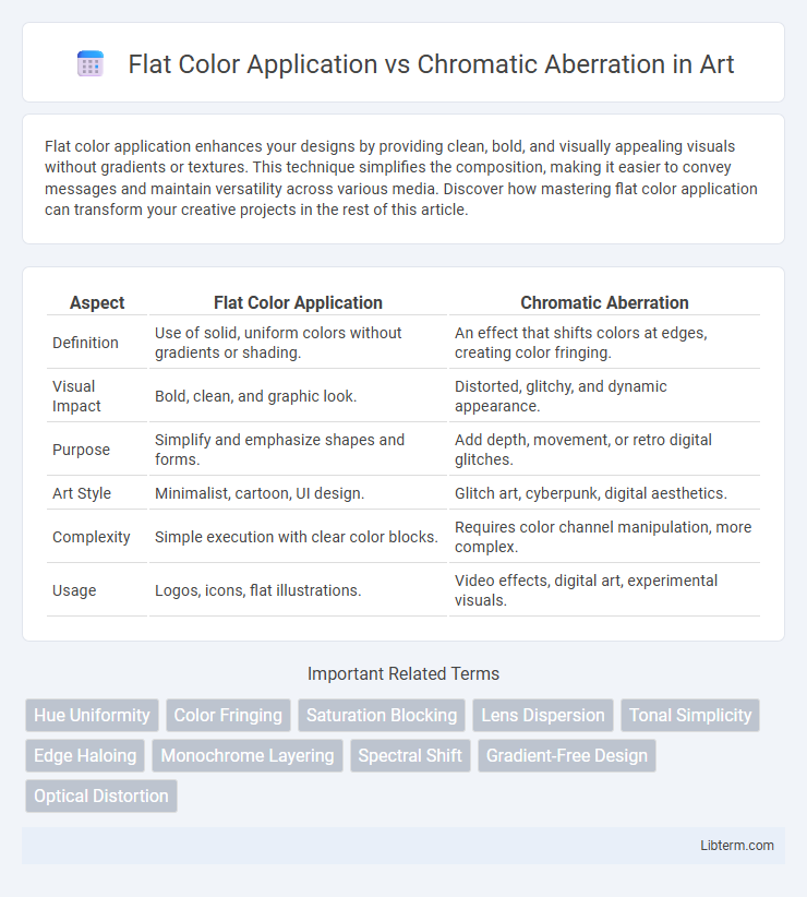
Table of Comparison
| Aspect | Flat Color Application | Chromatic Aberration |
|---|---|---|
| Definition | Use of solid, uniform colors without gradients or shading. | An effect that shifts colors at edges, creating color fringing. |
| Visual Impact | Bold, clean, and graphic look. | Distorted, glitchy, and dynamic appearance. |
| Purpose | Simplify and emphasize shapes and forms. | Add depth, movement, or retro digital glitches. |
| Art Style | Minimalist, cartoon, UI design. | Glitch art, cyberpunk, digital aesthetics. |
| Complexity | Simple execution with clear color blocks. | Requires color channel manipulation, more complex. |
| Usage | Logos, icons, flat illustrations. | Video effects, digital art, experimental visuals. |
Introduction to Flat Color Application and Chromatic Aberration
Flat color application involves using uniform, solid colors without gradients or shading, creating a clean and minimalist visual style ideal for graphic design and digital art. Chromatic aberration refers to a distortion in imaging where colors separate due to lens dispersion, often seen as color fringes along edges in photographs or videos. Understanding these concepts is essential for artists and photographers aiming to control visual clarity and stylistic effects in their work.
Defining Flat Color Application in Design
Flat color application in design refers to the use of solid, uniform colors without gradients, textures, or shading, creating a clean and minimalist aesthetic that enhances visual clarity and brand recognition. This technique emphasizes simplicity and legibility, often employed in modern digital interfaces, logos, and illustrations to ensure quick comprehension and strong visual impact. Chromatic aberration, contrastingly, involves distorted color fringes due to lens limitations, which is generally undesirable in flat color designs as it disrupts the crisp edges and uniformity essential to the style.
Understanding Chromatic Aberration Effects
Chromatic aberration occurs when a lens fails to focus all colors to the same convergence point, causing color fringing and image distortion along edges and high-contrast areas. In contrast, flat color application involves uniform color distribution without gradients or shading, which typically avoids introducing such optical distortions. Understanding chromatic aberration effects is crucial for photographers and digital artists aiming to correct or creatively enhance image quality by mitigating or simulating these color artifacts.
Key Differences: Flat Color Application vs Chromatic Aberration
Flat color application involves using uniform, solid colors without gradients or shading, creating a clean and simplified visual style. Chromatic aberration refers to the distortion of colors at the edges of images due to lens dispersion, resulting in color fringing and a blurred effect. The key difference lies in flat color application being an intentional design choice for clarity, while chromatic aberration is an optical artifact causing unintentional color distortion.
Visual Impact and Aesthetic Appeal
Flat color application creates a clean, uniform visual impact by emphasizing bold shapes and smooth gradients, enhancing clarity and modern aesthetic appeal. Chromatic aberration introduces deliberate color fringing and distortion, adding a dynamic, edgy look that suggests movement and depth. While flat colors prioritize minimalism and readability, chromatic aberration enhances atmospheric mood and artistic expression through its vibrant, glitch-like effects.
Usability in Digital and Print Media
Flat color application ensures consistent color reproduction across digital screens and print materials, making it highly reliable for branding and user interface design. Chromatic aberration introduces intentional color fringing, which can add visual interest in digital media but often complicates color accuracy in print, leading to potential misalignment and color shifts. For usability, flat colors offer clarity and legibility, essential for accessibility and professional presentation, whereas chromatic aberration serves more as an artistic effect with limited practical use in print.
Advantages of Flat Color Application
Flat Color Application enhances design clarity by providing consistent and uniform color coverage, which ensures sharp visual elements and easy reproduction across various media. It simplifies the printing process by reducing color variations and ink usage, leading to cost-effective and time-efficient production. This method improves brand recognition through stable and precise color representation, unlike Chromatic Aberration which introduces unwanted color distortions.
Benefits and Challenges of Chromatic Aberration
Chromatic aberration enhances visual depth by simulating lens imperfections, creating a more realistic and immersive experience compared to flat color application, which offers simplicity and consistency. Its benefits include adding artistic appeal and guiding viewer attention through subtle color fringing, but it poses challenges such as potential color distortion and increased rendering complexity. Managing chromatic aberration requires balancing visual impact with technical performance to avoid distractions while maintaining image clarity.
Choosing the Right Technique for Your Project
Flat color application offers clean, vivid visuals ideal for minimalist designs and projects requiring clear, bold communication without distractions. Chromatic aberration introduces artistic distortion by simulating lens imperfections, enhancing dynamic, retro, or glitch-inspired aesthetics suitable for creative storytelling and visual impact. Selecting the right technique depends on the project's tone, target audience, and desired emotional response, balancing clarity versus stylistic complexity.
Future Trends in Color Application and Design Approaches
Future trends in color application emphasize integrating flat color techniques with subtle chromatic aberration to create visually engaging digital experiences. Designers leverage advanced algorithms and AI-driven tools to enhance color accuracy while introducing controlled aberrations that add depth and dynamism. This hybrid approach balances minimalism and complexity, driving innovation in user interface design and immersive digital art.
Flat Color Application Infographic