Sepia, a natural pigment derived from the ink sac of the cuttlefish, has been used historically in art and photography for its rich, reddish-brown hues that add warmth and vintage charm to images. This distinctive color not only enhances visual depth but also evokes a sense of nostalgia and timelessness in creative works. Explore the rest of this article to discover how sepia can transform your artistic projects and the science behind its enduring appeal.
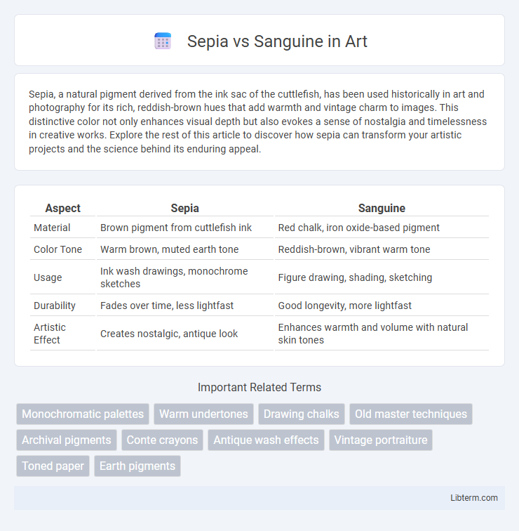
Table of Comparison
| Aspect | Sepia | Sanguine |
|---|---|---|
| Material | Brown pigment from cuttlefish ink | Red chalk, iron oxide-based pigment |
| Color Tone | Warm brown, muted earth tone | Reddish-brown, vibrant warm tone |
| Usage | Ink wash drawings, monochrome sketches | Figure drawing, shading, sketching |
| Durability | Fades over time, less lightfast | Good longevity, more lightfast |
| Artistic Effect | Creates nostalgic, antique look | Enhances warmth and volume with natural skin tones |
Introduction to Sepia and Sanguine
Sepia and sanguine are traditional drawing mediums valued for their warm tones and historical significance in art. Sepia, derived from the ink of cuttlefish, produces rich brown hues ideal for creating depth and shadow, while sanguine, a natural earth pigment with a reddish-brown color, offers softness and warmth perfect for figure drawing and sketches. Both materials have been favored since the Renaissance for their ability to evoke texture and tonal variation in sketches and fine art studies.
Historical Origins and Artistic Relevance
Sepia ink, derived from the ink sac of the cuttlefish Sepia officinalis, dates back to ancient Mediterranean civilizations where it was prized for its rich brown tones in manuscripts and illustrations. Sanguine, a reddish-brown drawing medium made of iron oxide pigments mixed with clay, originated during the Renaissance and became a favored tool for anatomical sketches and figure studies due to its warm, earthy hues. Both materials have maintained artistic relevance by offering distinctive tonal qualities that enhance texture and depth in classical and contemporary artworks.
Color Characteristics: Sepia Explained
Sepia is characterized by its warm, brownish tones that evoke a vintage or antique aesthetic, commonly used in photography and art to create a nostalgic feel. The color displays a range from deep brown to lighter tan hues, often associated with natural ink made from cuttlefish. Compared to sanguine, which features a reddish-brown tint reminiscent of rust or blood, sepia's earthy shades provide a more subdued and classic appearance.
Color Characteristics: Sanguine Explored
Sanguine features a warm, reddish-brown hue with earthy undertones, offering rich saturation and vibrant depth ideal for expressive sketches and tonal studies. Unlike sepia's softer, muted brown, sanguine provides stronger contrast and warmer highlights, enhancing the depiction of flesh tones and natural textures. This color characteristic makes sanguine a preferred choice in classical figure drawing and dynamic compositions.
Visual Impact in Artwork
Sepia tones create a warm, nostalgic visual impact with earthy brown hues that evoke a sense of antiquity and timelessness in artwork. Sanguine, characterized by its rich reddish-brown pigment, delivers a bold and vibrant presence that enhances depth and texture in sketches and drawings. Artists often choose sepia for subtlety and mood, while sanguine is preferred for dynamic contrast and emotive expression.
Popular Techniques and Mediums
Sepia techniques often utilize natural brown pigments derived from cuttlefish ink, applied through washes in watercolor, ink drawing, and engraving to achieve warm, monochromatic tones and fine detail. Sanguine involves using red chalk or ochre pigments on paper, popular for figure drawing and sketching due to its ability to create soft, warm highlights and rich shadows with chalk, pastel, or conte crayon. Both mediums excel in producing classical, textured effects, with sepia favored for ink-based artwork and sanguine for dry media sketches.
Applications in Modern Art and Photography
Sepia and sanguine tones play distinct roles in modern art and photography, with sepia offering a warm, vintage aesthetic ideal for evoking nostalgia and timelessness in photographic prints and digital edits. Sanguine, characterized by its rich, reddish-brown hue, is favored in drawing and figurative art to emphasize form and shading, mimicking natural sanguine chalk used by classical artists. Both tones enhance visual storytelling by adding depth and emotional resonance, with sepia commonly used in portraiture and landscapes, while sanguine excels in anatomical studies and expressive sketches.
Advantages of Using Sepia
Sepia offers superior color stability and archival quality compared to sanguine, making it ideal for long-lasting artwork. Its warm, brownish tone provides better contrast and subtlety in shading, enhancing the depth and realism of sketches. Sepia's versatility on various paper textures allows artists to achieve a range of expressive effects not easily replicated with sanguine.
Benefits of Working with Sanguine
Sanguine offers enhanced collaboration tools that streamline team workflows and improve communication efficiency compared to Sepia. Its intuitive interface supports real-time data integration, allowing users to make faster, data-driven decisions. Enterprises benefit from Sanguine's scalable architecture, which ensures seamless performance even with increasing user demands and complex projects.
Choosing Between Sepia and Sanguine: Which Suits Your Style?
Sepia offers warm, brownish tones ideal for creating vintage and classic artistic effects, enhancing depth and nostalgia in your work. Sanguine features reddish-brown hues that bring a natural warmth and softness, perfect for portraits or sketches emphasizing flesh tones and human anatomy. Selecting between sepia and sanguine depends on your desired mood and subject matter, with sepia suited for timeless, antiquated aesthetics and sanguine fitting organic, lively representations.
Sepia Infographic