Proportional symbols visually represent data by varying the size of symbols according to the magnitude of the values they depict, making complex information easier to interpret at a glance. These symbols are widely used in mapping, statistics, and infographics to emphasize differences in data effectively without overwhelming the viewer. Discover how to leverage proportional symbols for clearer, more impactful data visualization in the rest of this article.
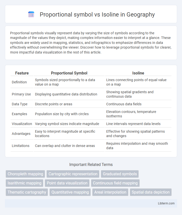
Table of Comparison
| Feature | Proportional Symbol | Isoline |
|---|---|---|
| Definition | Symbols sized proportionally to a data value on a map | Lines connecting points of equal value on a map |
| Primary Use | Displaying quantitative data distribution | Showing spatial gradients and continuous data |
| Data Type | Discrete points or areas | Continuous data fields |
| Examples | Population size by city with circles | Elevation contours, temperature isotherms |
| Visualization | Varying symbol sizes indicate magnitude | Line intervals represent data levels |
| Advantages | Easy to interpret magnitude at specific locations | Effective for showing spatial patterns and changes |
| Limitations | Can overlap and clutter in dense areas | Requires interpolation and may smooth data |
Introduction to Proportional Symbol and Isoline Maps
Proportional symbol maps use scaled symbols, such as circles or squares, to represent data values at specific geographic locations, allowing for immediate visual comparison of quantities. Isoline maps, also known as contour maps, display continuous data through lines connecting points of equal value, commonly used for elevation, temperature, or precipitation. Both map types serve distinct purposes in spatial analysis, with proportional symbols emphasizing discrete data magnitudes and isolines illustrating gradients and patterns across geographic regions.
Defining Proportional Symbol Maps
Proportional symbol maps represent data using symbols scaled in size according to quantitative values, allowing intuitive comparison of magnitude across geographic locations. Each symbol's area or diameter directly corresponds to the data attribute it represents, enhancing visual clarity in spatial distribution analysis. This method contrasts with isoline maps, which depict continuous data as lines connecting points of equal value, emphasizing gradients rather than discrete quantities.
Understanding Isoline Maps
Isoline maps represent continuous data through lines connecting points of equal value, such as elevation, temperature, or pressure, facilitating a clear visualization of gradients and spatial patterns. Unlike proportional symbol maps that use varying symbol sizes to depict discrete quantities at specific locations, isoline maps provide a comprehensive overview of how a variable changes across a geographic area. Understanding isoline maps is essential for interpreting phenomena like topography, weather patterns, and pollution levels in environmental and spatial analyses.
Key Differences Between Proportional Symbol and Isoline Maps
Proportional symbol maps use varying symbol sizes to represent data magnitude at specific points, providing clear quantitative comparisons across locations. Isoline maps display continuous data by connecting points of equal value with contour lines, effective for visualizing gradients such as elevation or temperature. Key differences include the discrete point representation in proportional symbol maps versus the continuous spatial representation in isoline maps, and the former's emphasis on magnitude versus the latter's focus on data distribution patterns.
Visual Representation Techniques
Proportional symbols use varying sizes of icons or markers to represent quantitative data, allowing viewers to easily compare magnitude differences across locations. Isolines connect points of equal value, creating continuous lines that illustrate gradients or spatial patterns such as elevation or temperature. Both techniques enhance spatial analysis by visually encoding data intensity but serve different purposes: proportional symbols emphasize discrete, localized values, while isolines reveal smooth transitions across geographic areas.
Suitable Data Types for Each Map
Proportional symbol maps are best suited for representing quantitative data with distinct values, such as population size or sales figures, where the size of symbols directly reflects data magnitudes. Isoline maps effectively depict continuous data fields like temperature, elevation, or air pressure by using contour lines to connect points of equal value, revealing gradients and spatial patterns. Selecting the appropriate map type depends on data characteristics: discrete, countable variables align with proportional symbols, while smoothly varying phenomena require isolines for accurate visualization.
Advantages of Proportional Symbol Maps
Proportional symbol maps excel in visually representing quantitative data through varying symbol sizes, enabling immediate comparison of values across geographic locations. They effectively display discrete data points and facilitate the recognition of patterns without the need for complex legends or color gradients. This clarity and direct correlation between symbol size and data magnitude make proportional symbol maps ideal for emphasizing individual data elements.
Benefits of Isoline Maps
Isoline maps offer precise visualization of continuous data by connecting points of equal value, making them ideal for representing variables like temperature, elevation, or precipitation. Their ability to reveal gradients and spatial patterns facilitates a clearer understanding of environmental and geographic trends. This continuous data portrayal enhances decision-making in fields such as meteorology, geology, and urban planning.
Common Applications and Use Cases
Proportional symbol maps excel in representing quantitative data, such as population sizes, economic indicators, or crime rates, by varying symbol sizes to reflect magnitude, making them ideal for census data analysis and market research. Isoline maps effectively depict continuous spatial data like elevation, temperature, and atmospheric pressure, facilitating meteorological forecasting, topographic surveys, and environmental monitoring. Both visualization techniques enhance geographic data interpretation, with proportional symbols emphasizing discrete quantity differences and isolines illustrating gradual data transitions across regions.
Choosing Between Proportional Symbol and Isoline Maps
Choosing between proportional symbol and isoline maps depends on the nature of the data and the visualization goals. Proportional symbol maps effectively represent discrete quantities at specific locations, using symbol size to indicate magnitude, ideal for population counts or event frequencies. Isoline maps, conversely, are best suited for continuous data such as elevation, temperature, or atmospheric pressure, using contour lines to connect points of equal value and reveal spatial gradients.
Proportional symbol Infographic