A Nichols chart provides a powerful graphical tool used in control systems engineering to analyze the frequency response and stability margins of feedback systems by plotting the open-loop gain versus phase. This chart allows engineers to design compensators and assess system performance directly on the plot, offering insights into gain margin, phase margin, and bandwidth. Discover how understanding the Nichols chart can enhance your ability to optimize control systems by exploring the detailed concepts in the following article.
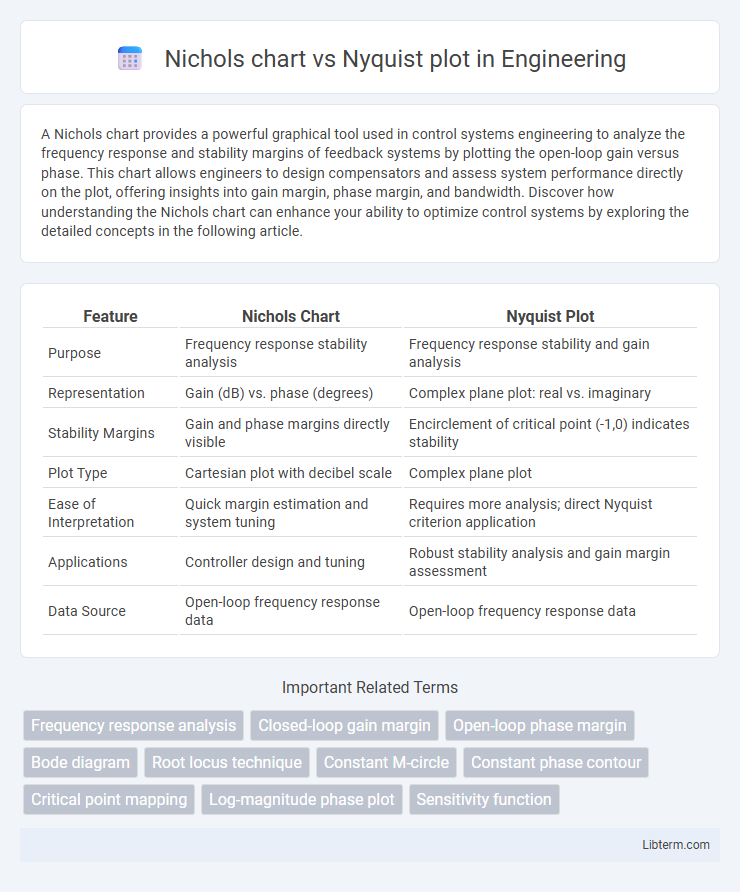
Table of Comparison
| Feature | Nichols Chart | Nyquist Plot |
|---|---|---|
| Purpose | Frequency response stability analysis | Frequency response stability and gain analysis |
| Representation | Gain (dB) vs. phase (degrees) | Complex plane plot: real vs. imaginary |
| Stability Margins | Gain and phase margins directly visible | Encirclement of critical point (-1,0) indicates stability |
| Plot Type | Cartesian plot with decibel scale | Complex plane plot |
| Ease of Interpretation | Quick margin estimation and system tuning | Requires more analysis; direct Nyquist criterion application |
| Applications | Controller design and tuning | Robust stability analysis and gain margin assessment |
| Data Source | Open-loop frequency response data | Open-loop frequency response data |
Introduction to Frequency Response Analysis
Nichols chart and Nyquist plot are fundamental tools in frequency response analysis used to assess the stability and performance of control systems. Nichols chart displays gain and phase simultaneously on a single plot, providing intuitive insights into system margins and robustness. Nyquist plot, on the other hand, represents the complex frequency response by plotting the imaginary versus real parts of the system transfer function, crucial for applying the Nyquist stability criterion.
Overview of the Nichols Chart
The Nichols chart graphically represents the frequency response of a control system by plotting open-loop gain (in decibels) against phase (in degrees), enabling straightforward assessment of gain and phase margins. It integrates both gain and phase information into a single plot, facilitating stability analysis and controller design through contour lines of constant closed-loop gain and phase margins. This visualization complements the Nyquist plot by offering a more intuitive interpretation of system robustness and performance in the frequency domain.
Fundamentals of the Nyquist Plot
The Nyquist plot represents frequency response by graphing the complex values of a system's open-loop transfer function, illustrating stability margins and phase gain characteristics. It maps the contour of the transfer function as frequency varies from zero to infinity, enabling assessment of closed-loop stability through encirclements of the critical point (-1,0). This fundamental approach allows direct visualization of gain and phase relationships, essential for control system stability analysis and robust controller design.
Key Differences Between Nichols Chart and Nyquist Plot
Nichols charts and Nyquist plots both analyze frequency response in control systems but differ in representation and application. Nichols charts plot gain (in dB) versus phase angle, combining them into a single graph that directly relates to closed-loop performance metrics, while Nyquist plots represent complex frequency response as a polar plot of real versus imaginary components. Nyquist plots are primarily used for stability analysis through encirclement of the critical point (-1,0), whereas Nichols charts facilitate simultaneous gain and phase margin assessment and controller tuning.
Applications in Control System Design
Nichols charts provide a direct visualization of gain and phase margins, facilitating robust stability analysis and loop shaping in control system design. Nyquist plots offer detailed insight into closed-loop stability by mapping the frequency response around the critical point, making them essential for assessing system robustness and stability margins. Both tools are complementary, with Nichols charts favored for precise gain and phase adjustments, while Nyquist plots excel in visualizing encirclements crucial for stability criteria in feedback systems.
Interpretation of Stability Margins
Nichols charts and Nyquist plots both provide critical insights into stability margins, with Nichols charts directly displaying gain margin and phase margin as clear offsets from critical points on the curves, facilitating quick evaluation of system robustness. Nyquist plots represent stability margins through encirclements of the critical point (-1,0), where the distance from the plot to this point correlates with gain and phase margins, but require additional interpretation to quantify these margins precisely. Engineers often prefer Nichols charts for their straightforward visual interpretation of stability margins in control system design and analysis.
Visualizing Gain and Phase Information
Nichols charts and Nyquist plots both visualize frequency response data; Nichols charts plot gain in decibels versus phase angle, making it easier to assess stability margins and design compensators directly from the gain-phase relationship. Nyquist plots represent the complex frequency response by plotting real versus imaginary parts of the open-loop transfer function, allowing evaluation of system stability through encirclements of the critical point (-1,0) in the complex plane. Gain and phase visualization in Nichols charts provides intuitive insight for controller tuning, while Nyquist plots offer comprehensive frequency-domain analysis emphasizing stability through contour mapping.
Practical Advantages of Nichols Chart
Nichols charts offer practical advantages by directly displaying gain and phase margins, enabling more intuitive stability analysis and controller tuning compared to Nyquist plots. They facilitate the visualization of frequency response and robust control design within a single plot, streamlining the adjustment of compensators in feedback systems. This makes Nichols charts particularly valuable in industrial applications where quick, precise frequency domain modifications are essential.
Practical Advantages of Nyquist Plot
Nyquist plots provide a comprehensive visualization of system frequency response by representing gain and phase simultaneously on the complex plane, facilitating straightforward stability analysis through encirclement criteria of the critical point (-1,0). They offer practical advantages in handling systems with time delays, as these delays translate into predictable phase shifts without requiring transformation or scaling like Nichols charts. This direct mapping aids engineers in identifying gain and phase margins efficiently and assessing robustness against variations in system parameters.
Choosing Between Nichols Chart and Nyquist Plot
Choosing between Nichols chart and Nyquist plot depends on the focus of control system analysis; Nichols charts excel at visualizing gain and phase margins simultaneously while facilitating design adjustments in frequency response. Nyquist plots provide a comprehensive view of system stability by mapping the complex frequency response, highlighting encirclements of the critical point essential for stability assessment. For design tuning and robustness evaluation, engineers prefer Nichols charts, whereas Nyquist plots are favored for detailed stability analysis and validation.
Nichols chart Infographic