A polar plot graphically represents data in terms of angles and radius, ideal for visualizing directional relationships and cyclical patterns. It transforms Cartesian coordinates into polar coordinates, allowing clear insight into phenomena like antenna radiation patterns or wind directions. Explore the full article to understand how to create and interpret polar plots effectively.
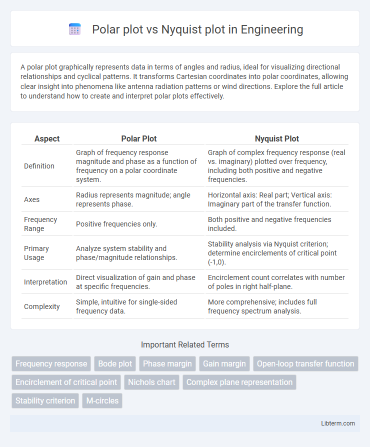
Table of Comparison
| Aspect | Polar Plot | Nyquist Plot |
|---|---|---|
| Definition | Graph of frequency response magnitude and phase as a function of frequency on a polar coordinate system. | Graph of complex frequency response (real vs. imaginary) plotted over frequency, including both positive and negative frequencies. |
| Axes | Radius represents magnitude; angle represents phase. | Horizontal axis: Real part; Vertical axis: Imaginary part of the transfer function. |
| Frequency Range | Positive frequencies only. | Both positive and negative frequencies included. |
| Primary Usage | Analyze system stability and phase/magnitude relationships. | Stability analysis via Nyquist criterion; determine encirclements of critical point (-1,0). |
| Interpretation | Direct visualization of gain and phase at specific frequencies. | Encirclement count correlates with number of poles in right half-plane. |
| Complexity | Simple, intuitive for single-sided frequency data. | More comprehensive; includes full frequency spectrum analysis. |
Introduction to Frequency Response Plots
Frequency response plots visualize how systems respond to varying frequencies, with Polar and Nyquist plots being key tools. Polar plots represent the system's complex frequency response as a locus in the complex plane, showcasing magnitude and phase simultaneously. Nyquist plots extend this by mapping the frequency response around the entire contour of the right half of the complex plane, highlighting system stability and gain margin in control systems analysis.
What is a Polar Plot?
A Polar Plot graphically represents the frequency response of a system by plotting the magnitude and phase of a complex function in polar coordinates, displaying how the output varies with frequency. It provides a visual representation of stability margins and gain variations in control systems by mapping the complex frequency response onto the complex plane. Polar plots are essential in control system analysis to assess gain crossover frequencies and phase shifts without directly showing frequency as in Nyquist plots.
What is a Nyquist Plot?
A Nyquist plot graphically represents a system's frequency response by plotting the complex values of the open-loop transfer function as the frequency varies from zero to infinity. It helps analyze stability and performance in control systems by showing how the gain and phase shift change over frequency. Unlike the Polar plot, which maps only magnitude and phase for positive frequencies, the Nyquist plot includes negative frequencies, providing a complete view of system behavior around the critical point (-1,0).
Key Differences Between Polar and Nyquist Plots
Polar plots represent frequency response data by plotting magnitude versus phase angle in a circular format, emphasizing stability margins in control systems. Nyquist plots graph the complex frequency response by plotting real versus imaginary components of a system's transfer function across frequencies, highlighting encirclements related to system stability via the Nyquist criterion. The key difference lies in their representation: polar plots focus on amplitude-phase relationships in a single plot, while Nyquist plots provide a complex-plane overview crucial for determining closed-loop stability.
Mathematical Representation
Polar plots represent complex functions by graphing the magnitude and phase angle of a complex number \( Z = re^{j\theta} \) as a point in the polar coordinate system, emphasizing the relationship \( r = |Z| \) and \( \theta = \arg(Z) \). Nyquist plots map the frequency response of a system's transfer function \( H(j\omega) \) onto the complex plane, plotting the real part \( \Re(H(j\omega)) \) versus the imaginary part \( \Im(H(j\omega)) \) over a range of frequencies \( \omega \). Both plots visualize complex-valued functions but differ as polar plots focus on magnitude and angle explicitly, while Nyquist plots reveal stability and feedback characteristics using parametric frequency-dependent mappings.
Applications in Control Systems
Polar plots and Nyquist plots are essential tools in control systems for stability analysis and frequency response characterization. Polar plots graph the complex frequency response of a system as a function of frequency, enabling designers to visualize gain and phase shifts directly, critical for assessing gain margins and phase margins. Nyquist plots extend this by mapping the open-loop frequency response around the critical point (-1,0), providing a comprehensive method to predict closed-loop system stability using the Nyquist stability criterion.
Advantages of Polar Plots
Polar plots offer a clear visualization of frequency response by representing magnitude and phase simultaneously on a single graph, making it easier to assess system stability and performance margins. They provide intuitive insight into gain and phase variations across frequencies without requiring complex transformations, unlike Nyquist plots which often involve mapping the entire complex plane. Furthermore, polar plots facilitate quick identification of resonance peaks and phase shifts critical for control system design and tuning.
Advantages of Nyquist Plots
Nyquist plots provide a comprehensive visualization of a system's frequency response by simultaneously representing both gain and phase information, enabling precise stability analysis. They allow engineers to easily determine the gain margin and phase margin, which are critical for designing robust control systems. Unlike polar plots, Nyquist plots effectively map complex plane encirclements, facilitating the application of the Nyquist stability criterion for feedback system evaluation.
Common Mistakes and Misinterpretations
Confusing the axes in polar plots and Nyquist plots leads to misinterpretation of phase and gain margins, which are critical in stability analysis. Interpreting Nyquist plot encirclements without considering the correct contour direction often causes errors in determining system stability. Failure to recognize that polar plots represent frequency response magnitude and phase in a single complex plane can result in incorrect frequency domain insights.
When to Use Polar Plot vs Nyquist Plot
Polar plots are ideal for visualizing the magnitude and phase relationship of a system's frequency response directly in the complex plane, making them useful for assessing stability margins in feedback systems. Nyquist plots extend this by mapping the frequency response to evaluate the encirclements of the critical point (-1,0), essential for applying the Nyquist stability criterion. Use polar plots for straightforward gain and phase analysis, and Nyquist plots when detailed stability assessment of control loops is required.
Polar plot Infographic