A Cartesian plot graphically represents data points using the Cartesian coordinate system, where each point is defined by an x and y value. This visual tool helps in identifying relationships, trends, and patterns between two variables effectively. Explore the full article to master creating and interpreting Cartesian plots for your data analysis.
Table of Comparison
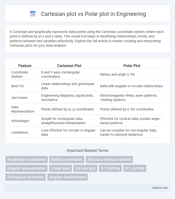
| Feature | Cartesian Plot | Polar Plot |
|---|---|---|
| Coordinate System | X and Y axes (rectangular coordinates) | Radius and angle (r, th) |
| Best For | Linear relationships and grid-based data | Data with angular or circular relationships |
| Use Cases | Engineering diagrams, signal plots, mechanics | Electromagnetic fields, wave patterns, rotating systems |
| Data Representation | Points defined by (x, y) coordinates | Points defined by (r, th) coordinates |
| Advantages | Simple for rectangular data, straightforward interpretation | Effective for cyclical data, reveals angle-based patterns |
| Limitations | Less effective for circular or angular data | Can be complex for non-angular data, harder to interpret distances |
Introduction to Cartesian and Polar Plots
Cartesian plots represent data using a rectangular coordinate system defined by orthogonal x and y axes, making them ideal for displaying linear relationships and functions. Polar plots use a circular coordinate system where each point is determined by an angle and a radius, effectively visualizing data with directional components or periodicity. Both plotting methods provide unique insights: Cartesian plots excel in analyzing Cartesian coordinates, while polar plots are essential for representing angular data and cyclic phenomena.
Fundamental Definitions
A Cartesian plot represents data points using rectangular coordinates defined by perpendicular x and y axes, where each point corresponds to an (x, y) pair. A polar plot uses polar coordinates, plotting points based on a radius and an angle from a fixed origin, typically expressed as (r, th). Cartesian plots excel in linear relationships, while polar plots are ideal for representing cyclical patterns and angular data.
Visual Representation Differences
Cartesian plots display data on a two-dimensional grid using perpendicular x and y axes, ideal for representing linear and rectangular relationships. Polar plots represent data based on angle and radius coordinates, making them suitable for circular patterns and periodic functions. The visual difference lies in Cartesian plots emphasizing horizontal and vertical scales, while polar plots highlight angular direction and distance from a central point.
Mathematical Equations and Axes
Cartesian plots represent data using perpendicular x and y axes based on rectangular coordinates, with points defined by ordered pairs (x, y) corresponding to linear equations such as y = mx + b. Polar plots use a circular coordinate system defined by a radius (r) and angle (th), where points are expressed as (r, th) and equations involve trigonometric functions like r = a sin(th) or r = b cos(th). The transformation between Cartesian and polar coordinates follows the equations x = r cos(th) and y = r sin(th), enabling conversion between linear and angular data representations.
Common Applications
Cartesian plots are commonly used in engineering and physics to represent linear relationships, such as displacement versus time or voltage versus current, providing straightforward visualization of data on horizontal and vertical axes. Polar plots are frequently employed in fields like antenna design, navigation, and signal processing to illustrate data dependent on angles and magnitudes, such as radiation patterns or directional response characteristics. Both plot types facilitate analysis of different data structures, with Cartesian plots ideal for rectangular coordinates and polar plots optimized for circular or angular data representation.
Advantages of Cartesian Plots
Cartesian plots excel in representing linear relationships with clear, fixed x and y axes, making data interpretation straightforward in many scientific and engineering applications. They provide precise visualization for discrete and continuous data, enabling easy identification of trends, slopes, and intercepts. Cartesian coordinates are highly compatible with most statistical tools and software, facilitating accurate analysis and comparison across various datasets.
Advantages of Polar Plots
Polar plots excel in representing data with directional components, making them ideal for illustrating phenomena such as wave patterns, antenna radiation, and cyclic behavior. Unlike Cartesian plots, polar plots provide intuitive visualization of angular relationships and periodicity, enabling clearer insights into data symmetry and amplitude changes. Their ability to handle circular data naturally supports applications in navigation, meteorology, and physics where angle and radius are fundamental parameters.
Limitations and Challenges
Cartesian plots face challenges in representing cyclical or periodic data as they rely on perpendicular x and y axes, making radial symmetry difficult to visualize effectively. Polar plots excel at displaying data with angular relationships but can suffer from distortion when representing variables with large magnitude ranges, limiting precision in detailed analysis. Both plotting methods require careful consideration of the data structure to avoid misinterpretation and inaccurate conclusions.
Choosing the Right Plot for Data
When choosing the right plot for data visualization, Cartesian plots excel in displaying linear relationships with clear x and y axes, making them ideal for time series, correlation, and scatter data. Polar plots are optimal for representing cyclical patterns, directional data, or periodic phenomena where angle and radius provide meaningful insights, such as in meteorology, radar charts, or signal processing. Selecting between Cartesian and Polar plots depends on the inherent structure of the dataset and the specific features that need to be highlighted for accurate interpretation.
Conclusion and Recommendations
Cartesian plots excel at representing data with linear relationships and rectangular coordinates, making them ideal for most standard algebraic functions and trend analysis. Polar plots are best suited for data with cyclical or directional properties, such as frequency or angular measurements in engineering and physics. For clear visualization, choose Cartesian plots for straightforward variable comparisons and polar plots when data involves angles or periodicity to ensure accurate interpretation.
Cartesian plot Infographic