Isarithmic maps display continuous data using lines of equal value, effectively visualizing variables like temperature, elevation, or precipitation across a region. These maps help identify gradients and spatial patterns, making complex geographic information easier to interpret. Explore the rest of the article to understand how isarithmic mapping techniques can enhance your spatial data analysis.
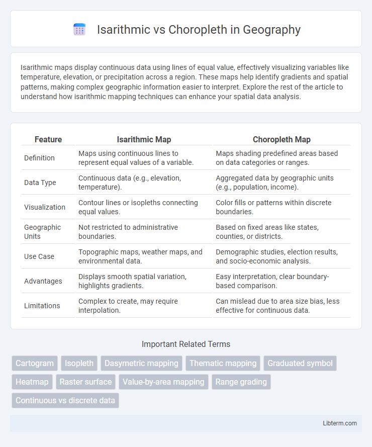
Table of Comparison
| Feature | Isarithmic Map | Choropleth Map |
|---|---|---|
| Definition | Maps using continuous lines to represent equal values of a variable. | Maps shading predefined areas based on data categories or ranges. |
| Data Type | Continuous data (e.g., elevation, temperature). | Aggregated data by geographic units (e.g., population, income). |
| Visualization | Contour lines or isopleths connecting equal values. | Color fills or patterns within discrete boundaries. |
| Geographic Units | Not restricted to administrative boundaries. | Based on fixed areas like states, counties, or districts. |
| Use Case | Topographic maps, weather maps, and environmental data. | Demographic studies, election results, and socio-economic analysis. |
| Advantages | Displays smooth spatial variation, highlights gradients. | Easy interpretation, clear boundary-based comparison. |
| Limitations | Complex to create, may require interpolation. | Can mislead due to area size bias, less effective for continuous data. |
Understanding The Basics: Isarithmic and Choropleth Maps
Isarithmic maps use continuous lines to represent equal values of a variable, ideal for visualizing gradients like temperature or elevation, while choropleth maps display data aggregated within predefined political or geographical boundaries, such as states or counties, highlighting variations across regions. Isarithmic maps emphasize smooth transitions and spatial continuity, whereas choropleth maps focus on discrete area-based comparisons with color-coded shading. Understanding these fundamental differences aids in selecting the appropriate mapping technique for accurate spatial analysis and effective data communication.
Key Principles of Isarithmic Mapping
Isarithmic mapping relies on continuous data representation using isolines to connect points of equal value, enabling precise visualization of gradual spatial variations such as temperature or elevation. Unlike choropleth maps that aggregate data into predefined areas with uniform color shading, isarithmic maps emphasize smooth transitions and detailed gradients without abrupt boundaries. Key principles include accurate interpolation between measurement points, consistent isoline intervals, and clear labeling to enhance interpretability of complex scalar fields.
Fundamentals of Choropleth Mapping
Choropleth mapping visualizes data by shading predefined geographic areas, such as states or counties, based on statistical values, making it ideal for representing discrete spatial units with aggregated data. The fundamental principle of choropleth maps involves classification schemes like equal intervals, quantiles, or natural breaks to categorize data ranges effectively for clear visual distinction. Accurate normalization of data by area or population is crucial to prevent misleading interpretations caused by varying region sizes in choropleth maps.
Data Types Suitable for Each Technique
Isarithmic maps excel in representing continuous data such as temperature, elevation, and atmospheric pressure, using smooth gradient lines called isopleths to display subtle transitions. Choropleth maps are best suited for aggregated, regional data like population density, election results, or economic indicators, where distinct geographic boundaries define areas with uniform values. Choosing between isarithmic and choropleth mapping depends on whether the data is continuous and spatially interpolated or categorical and regionally summarized.
Visual Representation Differences
Isarithmic maps use continuous color gradients to represent data fields like temperature or elevation, creating smooth transitions without distinct boundaries. Choropleth maps display data aggregated within predefined geographic areas, using different shades or colors to indicate variation across regions. Isarithmic maps excel at showing gradual spatial changes, while choropleth maps emphasize discrete regional comparisons.
Advantages of Isarithmic Maps
Isarithmic maps provide detailed visualization of continuous data by using smooth color gradients to represent variations, which enhances the accuracy of spatial patterns compared to choropleth maps that use discrete color blocks. These maps are especially advantageous for displaying meteorological data like temperature or precipitation, where data points are interpolated between observations to create a seamless surface. Isarithmic maps reduce the risk of misleading interpretations caused by abrupt boundaries in choropleth maps, allowing for a more precise understanding of geographic phenomena.
Advantages of Choropleth Maps
Choropleth maps provide clear visualization of data aggregated by predefined administrative boundaries such as states or counties, making them ideal for demographic and election data analysis. Their ease of interpretation allows viewers to quickly identify spatial patterns and trends using color gradients that represent varying data values, enhancing decision-making processes. This map type efficiently conveys information where data is naturally grouped, minimizing ambiguity and improving communication of complex spatial distributions.
Common Pitfalls and Misinterpretations
Isarithmic maps, which use continuous lines to represent data gradients, are often confused with choropleth maps that depict data aggregated by predefined areas, leading to misinterpretation of spatial variation. A common pitfall is applying choropleth color schemes to isarithmic maps, causing inaccurate visual cues about data distribution, as choropleth maps emphasize area-based averages rather than smooth transitions. Misunderstanding these differences may result in incorrect conclusions about spatial patterns, especially when continuous environmental variables are presented as discrete administrative boundaries.
Choosing the Right Map for Your Data
Isarithmic maps use smooth color gradients to represent continuous data variations such as temperature or elevation, making them ideal for datasets with gradual changes across geographic space. Choropleth maps display discrete data aggregated by predefined areas like counties or states, effectively highlighting differences in categories such as population density or election results. Selecting the right map depends on your data type--continuous data benefits from isarithmic mapping for detailed spatial patterns, while categorical or aggregated data is better suited for choropleth visualization to emphasize regional comparisons.
Practical Applications and Real-World Examples
Isarithmic maps are ideal for representing continuous data such as temperature gradients or elevation changes, frequently used in meteorology and environmental studies to visualize smooth transitions. Choropleth maps are better suited for discrete data, like population density or electoral results, where geographic regions such as counties or states are shaded based on statistical values. Real-world applications include isarithmic maps in weather forecasting to show temperature contours, while choropleth maps dominate demographic studies and political analysis for clearly defined administrative areas.
Isarithmic Infographic