A Nichols chart is a powerful tool in control system engineering used to analyze and design feedback systems by plotting open-loop frequency response data. This chart helps assess stability, gain margin, and phase margin, providing a clear visualization of system performance and robustness. Explore the rest of the article to understand how to interpret Nichols charts and apply them to optimize Your control system design.
Table of Comparison
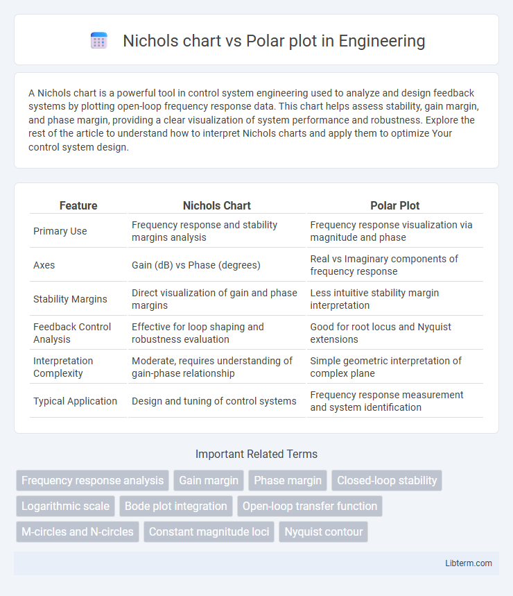
| Feature | Nichols Chart | Polar Plot |
|---|---|---|
| Primary Use | Frequency response and stability margins analysis | Frequency response visualization via magnitude and phase |
| Axes | Gain (dB) vs Phase (degrees) | Real vs Imaginary components of frequency response |
| Stability Margins | Direct visualization of gain and phase margins | Less intuitive stability margin interpretation |
| Feedback Control Analysis | Effective for loop shaping and robustness evaluation | Good for root locus and Nyquist extensions |
| Interpretation Complexity | Moderate, requires understanding of gain-phase relationship | Simple geometric interpretation of complex plane |
| Typical Application | Design and tuning of control systems | Frequency response measurement and system identification |
Introduction to Nichols Chart and Polar Plot
Nichols chart and polar plot are essential tools in control systems engineering for frequency response analysis and stability assessment. The Nichols chart combines gain and phase information into a single plot, displaying the frequency response with contours of constant closed-loop gain and phase margins, facilitating robust controller design. The polar plot represents the complex frequency response of a system as a locus of points in the complex plane, showing magnitude and phase variations as frequency changes to evaluate gain and phase margins visually.
Historical Background and Development
The Nichols chart, developed in the mid-20th century by Nathaniel B. Nichols, emerged as a pivotal tool for frequency response analysis in control system design, enabling engineers to plot gain versus phase margin intuitively. Concurrently, the polar plot, rooted in earlier complex plane representations of system behavior, provided direct visualization of a system's frequency response by mapping magnitude and phase angle onto a complex plane. Both tools evolved with advances in control theory and computation, solidifying their roles in stability and robustness assessment of linear time-invariant systems.
Fundamental Principles of Nichols Chart
Nichols chart represents frequency response data by plotting open-loop gain magnitude (in dB) against phase (in degrees), providing a direct visualization of system stability margins and gain crossover frequency. Unlike polar plots, which display complex frequency response as a trajectory in the complex plane, Nichols charts transform this information into a two-dimensional plot combining gain and phase, simplifying the assessment of gain margin, phase margin, and closed-loop performance. This fundamental principle enables control engineers to easily interpret stability criteria and design compensators for robust feedback control systems.
Core Concepts of Polar Plot
Polar plots graphically represent frequency response data by plotting magnitude and phase of a system's transfer function on a complex plane, emphasizing the stability margin and gain crossover frequency. Core concepts include the Nyquist plot characteristics, phase margin, and gain margin derived from the plot's encirclements of the critical point (-1,0). Unlike Nichols charts, which combine gain and phase on a rectangular plot with contour lines, polar plots directly visualize the system's frequency response as a circular trajectory aiding intuitive stability analysis.
Key Differences Between Nichols Chart and Polar Plot
Nichols charts display frequency response data by plotting the open-loop gain magnitude against phase angle, providing insights into system stability margins such as gain and phase margin. Polar plots represent the frequency response as a complex plane trajectory, showing the locus of the system's frequency response and its distance from critical points like the (-1,0) point for stability assessment. The Nichols chart emphasizes phase-gain relationship for control design, while the polar plot focuses on geometric interpretation of Nyquist stability criteria.
Applications in Control Engineering
Nichols charts and polar plots are essential tools in control engineering for analyzing system stability and performance. Nichols charts provide a comprehensive view of gain and phase margins by plotting frequency response data in terms of open-loop gain versus phase, making them ideal for designing and tuning feedback controllers. Polar plots offer a geometric representation of frequency response, highlighting system stability by displaying the locus of the open-loop transfer function, which is particularly useful for Nyquist stability analysis and robust control design.
Advantages and Limitations of Nichols Chart
Nichols chart provides a clear visualization of gain and phase margins, enhancing the stability analysis of control systems with frequency response data. It combines gain and phase information in a single plot, which simplifies the process of tuning controllers compared to separate plots like Bode or Polar plots. Limitations include difficulty interpreting nonlinear system behavior and less intuitive understanding for beginners compared to more visually intuitive Polar plots.
Strengths and Drawbacks of Polar Plot
Polar plots excel in visualizing system frequency response by directly representing gain and phase, making them intuitive for assessing stability margins and resonant peaks. However, polar plots can become cluttered and less interpretable for complex systems with multiple poles and zeros, where overlapping curves obscure detailed analysis. Unlike Nichols charts, polar plots do not explicitly display gain margin and phase margin values, limiting their effectiveness for precise quantitative stability assessment.
Comparative Analysis: Performance and Use Cases
Nichols charts excel in providing a clear visualization of system stability margins by plotting open-loop gain versus phase, making them ideal for frequency response analysis in control system design. Polar plots, on the other hand, represent complex frequency responses in a circular manner, offering intuitive insights into gain and phase relationships at specific frequencies, often used for robust stability assessment. While Nichols charts are preferred for tuning controllers and evaluating gain and phase margins simultaneously, polar plots are advantageous in assessing Nyquist stability criteria and resonance characteristics in feedback systems.
Choosing Between Nichols Chart and Polar Plot
Nichols charts provide a clear visualization of gain and phase margins directly on a single plot, making them ideal for control system stability analysis and robust design evaluations. Polar plots emphasize the frequency response of the system by plotting the open-loop frequency response in the complex plane, which aids in identifying stability boundaries through encirclements of the critical point. Choosing between Nichols chart and polar plot depends on the specific analysis needs: Nichols charts excel in margin quantification and design tuning, while polar plots offer intuitive insights into frequency response and Nyquist stability criteria.
Nichols chart Infographic