The Lorenz curve is a graphical representation used to illustrate income or wealth distribution within a population, highlighting inequality levels. It plots the cumulative percentage of total income earned against the cumulative percentage of recipients, starting with the poorest. Explore the rest of the article to understand how the Lorenz curve measures inequality and its practical applications in economics.
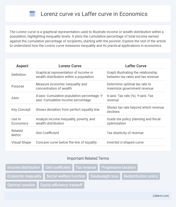
Table of Comparison
| Aspect | Lorenz Curve | Laffer Curve |
|---|---|---|
| Definition | Graphical representation of income or wealth distribution within a population | Graph illustrating the relationship between tax rates and tax revenue |
| Purpose | Measure economic inequality and concentration of wealth | Determine optimal tax rate to maximize government revenue |
| Axes | X-axis: Cumulative population percentage; Y-axis: Cumulative income percentage | X-axis: Tax rate (%); Y-axis: Tax revenue |
| Key Concept | Shows deviation from perfect equality line | Shows tax rate beyond which revenue declines |
| Use in Economics | Analyze income inequality, poverty, and wealth distribution | Guide tax policy planning and fiscal optimization |
| Related Metric | Gini Coefficient | Tax elasticity of revenue |
| Visual Shape | Concave curve below the line of equality | Inverted U-shaped curve |
Introduction to Lorenz Curve and Laffer Curve
The Lorenz Curve graphically represents income or wealth distribution within a population, illustrating economic inequality by plotting cumulative income against cumulative population percentage. The Laffer Curve illustrates the relationship between tax rates and total tax revenue, suggesting that increasing tax rates beyond a certain point reduces revenue by discouraging economic activity. Both curves serve as fundamental tools in economics, with the Lorenz Curve focusing on inequality measurement and the Laffer Curve on taxation efficiency.
Defining the Lorenz Curve: Measuring Income Inequality
The Lorenz curve graphically represents income inequality by plotting the cumulative percentage of total income against the cumulative percentage of recipients, starting from the poorest to the richest. Unlike the Laffer curve, which illustrates tax revenue relative to tax rates, the Lorenz curve emphasizes wealth distribution within an economy, highlighting disparities among different socioeconomic groups. Key metrics derived from the Lorenz curve, such as the Gini coefficient, quantify inequality levels, enabling policymakers to assess and address economic imbalances effectively.
Understanding the Laffer Curve: Taxation and Revenue
The Laffer Curve illustrates the relationship between tax rates and tax revenue, highlighting that there is an optimal tax rate that maximizes government revenue without discouraging productivity. It suggests that both extremely high and very low tax rates result in lower tax revenue due to reduced economic incentives or insufficient tax collection. In contrast, the Lorenz Curve measures income inequality within a population by plotting cumulative income distribution against the population percentile, offering insights into economic disparity rather than tax policy effects.
Historical Origins and Economic Context
The Lorenz curve, developed by Max O. Lorenz in 1905, originated as a graphical representation to illustrate income inequality within a given population, providing a foundation for modern welfare economics and disparity measurement. The Laffer curve, introduced by economist Arthur Laffer in the 1970s during the economic policy debates in the United States, conceptually demonstrates the relationship between tax rates and tax revenue, emphasizing the potential for optimal taxation to maximize government income without discouraging productivity. Both curves emerged in distinct economic contexts--the Lorenz curve amid early 20th-century social reform movements concerned with equity, and the Laffer curve during late 20th-century discussions on supply-side economics and fiscal policy.
Mathematical Foundations: Comparisons and Contrasts
The Lorenz curve represents income or wealth distribution by plotting cumulative population percentages against cumulative income percentages, mathematically illustrating inequality through the area between the curve and the line of equality. In contrast, the Laffer curve models the relationship between tax rates and tax revenue, using a quadratic function that predicts an optimal tax rate maximizing revenue without discouraging economic activity. While the Lorenz curve is grounded in cumulative distribution functions and inequality metrics like the Gini coefficient, the Laffer curve relies on economic behavior models and non-linear optimization to demonstrate fiscal effects of taxation rates.
Visualizing Economic Concepts: Graphical Interpretations
The Lorenz curve graphically represents income or wealth distribution within an economy, plotting the cumulative percentage of total income against the cumulative percentage of the population, highlighting inequality levels. The Laffer curve illustrates the relationship between tax rates and tax revenue, showing the optimal tax rate that maximizes government revenue without discouraging productivity. Both curves serve as powerful visual tools for understanding economic concepts, emphasizing income disparity and tax policy efficiency through distinct graphical interpretations.
Applications in Policy Analysis
The Lorenz curve visually represents income or wealth distribution within a population, aiding policymakers in assessing economic inequality and designing targeted social welfare programs. The Laffer curve illustrates the relationship between tax rates and tax revenue, guiding fiscal policy decisions to optimize taxation without discouraging productivity. Using both curves together enables comprehensive economic policy analysis, balancing equity and efficiency objectives in taxation and redistribution strategies.
Limitations and Critiques of Each Curve
The Lorenz curve, used to represent income inequality, faces limitations such as oversimplifying wealth distribution and failing to capture multidimensional aspects of economic disparity. The Laffer curve, illustrating the relationship between tax rates and tax revenue, is critiqued for its theoretical assumptions and lack of empirical consistency across different economies. Both curves provide valuable insights but require cautious interpretation due to their inherent simplifications and context-dependent applicability.
Real-World Implications: Case Studies
The Lorenz curve, widely used in economics to depict income inequality, reveals the distribution of wealth within societies, as demonstrated by case studies in countries like South Africa and Brazil where high income disparities hinder social mobility and economic growth. The Laffer curve illustrates the relationship between tax rates and tax revenue, with empirical evidence from the United States showing that beyond a certain tax rate, increases lead to lower revenue due to reduced incentives for work and investment. Policymakers leveraging insights from both curves have optimized tax policies to balance fairness and efficiency, as seen in Scandinavian countries where moderate tax rates and redistributive welfare policies correlate with lower income inequality and sustained economic productivity.
Conclusion: Lorenz vs Laffer Curve – Key Takeaways
The Lorenz curve graphically represents income or wealth distribution within a population, highlighting inequality levels, while the Laffer curve illustrates the relationship between tax rates and tax revenue, emphasizing optimal taxation points. Understanding the Lorenz curve aids policymakers in addressing economic inequality, whereas the Laffer curve guides tax policy to balance revenue generation without hindering economic growth. Both curves serve distinct but complementary roles in economic analysis, one focusing on social equity and the other on fiscal efficiency.
Lorenz curve Infographic