A polar plot visualizes data in a circular graph where each point is determined by an angle and a distance from the center. This type of plot is ideal for representing directional data, such as wind patterns or antenna radiation. Explore the rest of the article to learn how a polar plot can enhance your data analysis.
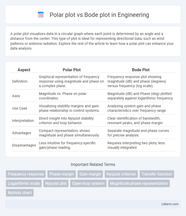
Table of Comparison
| Aspect | Polar Plot | Bode Plot |
|---|---|---|
| Definition | Graphical representation of frequency response using magnitude and phase on a complex plane. | Frequency response plot showing magnitude (dB) and phase (degrees) versus frequency (log scale). |
| Axes | Magnitude vs. Phase on polar coordinates. | Magnitude (dB) and Phase (deg) plotted separately against logarithmic frequency. |
| Use Case | Visualizing stability margins and gain-phase relationship in control systems. | Analyzing system gain and phase characteristics over frequency range. |
| Interpretation | Direct insight into Nyquist stability criterion and loop behavior. | Clear identification of bandwidth, resonant peaks, and phase margin. |
| Advantages | Compact representation; shows magnitude and phase simultaneously. | Separate magnitude and phase curves for precise analysis. |
| Disadvantages | Less intuitive for frequency-specific gain/phase reading. | Requires interpreting two plots; less visually integrated. |
Introduction to Frequency Response Analysis
Polar plots represent frequency response by mapping complex gain values on the complex plane, showing magnitude and phase simultaneously. Bode plots separate these characteristics into two graphs: magnitude versus frequency and phase versus frequency, facilitating detailed analysis across logarithmic frequency scales. Both tools are essential in control systems and signal processing for interpreting system stability and performance under varying frequency conditions.
Overview of Polar Plots
Polar plots graphically represent a system's frequency response by displaying complex values as points on a circular plane, highlighting magnitude and phase across frequencies. Used extensively in control systems and signal processing, polar plots visualize stability margins and resonances through their distinctive loop shapes. Compared to Bode plots, polar plots provide an immediate insight into phase and gain interactions without separating magnitude and phase into individual graphs.
Overview of Bode Plots
Bode plots graphically represent a system's frequency response using two separate plots: magnitude (in dB) and phase (in degrees) versus frequency on a logarithmic scale. They are essential tools in control engineering and signal processing for analyzing system stability, gain margin, and phase margin. Unlike polar plots, Bode plots provide clear insights into frequency-dependent behavior and are widely used for designing and tuning feedback systems.
Key Differences Between Polar and Bode Plots
Polar plots represent frequency response using magnitude and phase as a parametric plot on the complex plane, whereas Bode plots display magnitude (in decibels) and phase (in degrees) separately as functions of frequency on logarithmic scales. Polar plots provide an intuitive visualization of system stability margins like gain and phase margins by tracing a curve around the critical point (-1,0), while Bode plots facilitate detailed frequency analysis and design through distinct magnitude and phase frequency responses. The choice between polar and Bode plots depends on the analysis goal, with polar plots highlighting stability in Nyquist criteria and Bode plots optimizing controller tuning through frequency-dependent behavior.
Applications of Polar Plots in Control Engineering
Polar plots visualize frequency response by representing complex gains as magnitude and phase angles, making them essential for assessing system stability and performance in control engineering. They are particularly useful for analyzing Nyquist stability criteria, gain and phase margins, and resonance behavior in feedback control systems. Engineers utilize polar plots to design and tune controllers by observing the trajectory of the frequency response to ensure desired robustness and stability margins.
Applications of Bode Plots in System Analysis
Bode plots are essential in control system analysis for evaluating system stability and frequency response by displaying gain and phase margins. They enable engineers to design compensators and predict resonance behavior under varying frequency inputs. Compared to polar plots, Bode plots provide clearer insights into system robustness and bandwidth for feedback control applications.
Advantages of Using Polar Plots
Polar plots provide a clear visualization of frequency response by directly representing magnitude and phase in a single graph, enabling intuitive interpretation of system stability and gain margins. Their ability to display complex impedance and transfer functions in a circular format simplifies the identification of resonance and phase crossover points. Unlike Bode plots, polar plots reduce the need for separate magnitude and phase graphs, making them highly effective for control system analysis and frequency domain design.
Advantages of Using Bode Plots
Bode plots provide a clear visualization of a system's frequency response by displaying gain and phase shift separately, facilitating easier interpretation of stability margins such as gain margin and phase margin. Unlike polar plots, Bode plots allow straightforward application of logarithmic scaling, which enhances the analysis of wide frequency ranges and makes it easier to identify resonance peaks and bandwidth. Engineers prefer Bode plots for designing and tuning control systems due to their ability to simplify the assessment of system behavior in both magnitude and phase domains.
Limitations and Challenges of Both Plots
Polar plots have limitations in representing gain and phase margin clearly, often complicating stability analysis for complex control systems. Bode plots, while effective in frequency response visualization, can be challenging to interpret for non-linear systems and require careful scale reading to avoid misjudging phase shifts. Both plots face difficulties in accurately capturing system behavior under varying operating conditions, limiting their effectiveness for multi-variable or highly dynamic system analysis.
Choosing the Right Plot for Frequency Analysis
Polar plots provide a visual representation of system gain and phase over frequency on a single complex plane, making them ideal for evaluating stability margins in control systems. Bode plots separately display gain (magnitude) and phase versus logarithmic frequency, offering clearer insight into frequency response characteristics and easier identification of bandwidth and resonant peaks. Selecting the right plot depends on whether the analysis prioritizes combined gain-phase relationships (polar plot) or detailed magnitude and phase trends over frequency (Bode plot).
Polar plot Infographic